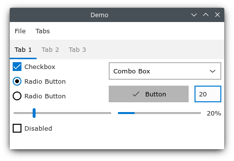
I have tried running this only on Windows. There are enough problems that I’m just filing this lot in one issue rather than filing many issues. Do what you will with this feedback; I doubt I shall return to the project. (I was trying it out out of curiosity; I have no near-future projects that could benefit from such a thing.)
- Doesn’t handle high-DPI displays.
- The web view is not initially focused, so keyboard shortcuts don’t work until you click into the window.
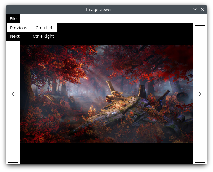
- Alt should be getting me access to the menus, e.g. Alt followed by F, or Alt+F, for the File menu. Use access keys everywhere, with & prefixing being the standard (e.g. “&File”), and underline the corresponding character in the menus when interacting with them by keyboard (that is, it’s acceptable, though not required, to hide the underline if you’re clicking, but it’s required that you show the underlines if you’re using the keyboard at all).
- Arrow keys should navigate around inside and between menus.
- Menus need to completely steal and hold focus.
- You should very strongly consider using native menus rather than HTML ones, since you basically need to do that on macOS to feel native anyway.
- In tabs, I expect Ctrl+Tab to switch to the next and Ctrl+Shift+Tab the previous.
- The keyboard shortcut technical mechanism is way too simple and will not scale well at all.
- Keyboard shortcuts are not formatted according to platform conventions. On Windows the keyboard shortcut platform convention is to use + for chords, not -; e.g. Ctrl+Q, not Ctrl-Q. macOS’s conventions are much more radically different, and better-documented too.
- You should set
cursor: default on the root, to go with the user-select: none behaviour. cursor: auto should be withheld for places like .selectable.
user-select: none doesn’t work properly in MSHTML (which you’re using on Windows), as it only blocks selection from starting inside such an area, not from selecting text. This means that to do things properly you need to manage the selection more actively. We do this in Fastmail’s webmail (on which I work), where UI elements are generally user-select: none, and we also want to contain the selection, so that when showing multiple emails in a thread, a selection starting inside one message doesn’t extend outside that message (this matches people’s expectations).
- Setting
* { user-select: none; } is a bad idea; it’s generally better to set :root { user-select: none } and rely on the cascade.
- You look to have implemented what you could with div soup. This is a terribly bad idea. Effects include:
- Most controls are not focusable.
- Basically nothing is screen-reader accessible.
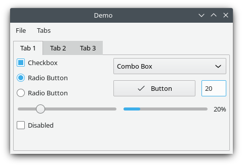
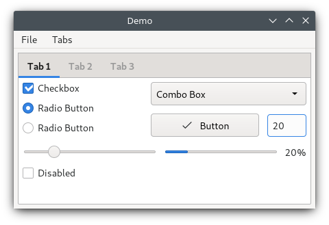
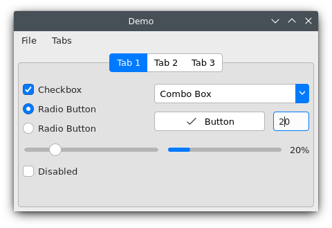
I strongly recommend that you have a look at how other projects do things, both desktop and web. For desktop, Qt is often a good one to look at, and Microsoft and Apple’s native toolkits are good too. For web, the story is much weaker, in part because it’s generally not about using web tech on the desktop, but rather on the web where various additional limitations apply and where you’re not trying to imitate a desktop platform; but there are a few options out there that work well for general UI, and I would consider Office UI Fabric’s React implementation to be the best in most regards.
On the div soup problem: use the native control elements everywhere, even when it makes styling harder, as long as it’s still possible. Set ARIA attributes where suitable and definitely where you don’t use the native form field types. Manage focus properly. Familiarise yourself with documents like ARIA in HTML and WAI-ARIA Authoring Practices.
As it stands, I like the goals of this project, but I think you’re ignoring too much good work that already exists, and implementing all the same basic problems all over again, with some additional problems to boot where you’re doing things in ways that are discouraged everywhere, and not just a matter of web tech not being perfectly adapted to desktop problems.
The feel of the entire library at present is “technical proof of concept”. In web terms, it feels more like jQuery in its ad-hocness and less like a solid MVC framework. There’s far more code than there should be in many places due to things like you reimplementing parts of the DOM, but not as much as the DOM provides either. I strongly recommend aiming to wrap existing DOM functionality more of the time, rather than reimplementing it badly on top of it. There are various other places where the design is not going to scale well; for example, the listener approach is quite insufficient for keyboard shortcuts, because you often want to enable or disable keyboard shortcuts based upon the presence of widgets on screen, but the widgets won’t ancestors of the focused element, so under your current design such things would tend to need to go on the window listener, which scales very poorly.
The underlying library that we use at Fastmail is a home-grown one and open source, Overture. We don’t generally recommend other people use it (I’m not aware of anyone other than us that uses it, and we definitely maintain it for ourselves), but there are parts of it that you could find useful to think about in its design—because unlike most JS libraries, it is very much designed for making applications, and not web pages. Perhaps most immediately pertinent is its handling of keyboard shortcuts and modals. It starts with needing to track when views enter and exit the document, so that they can register and unregister things.
In more popular code for the web, I again recommend Fabric React. Its management of things like focus styling and functionality is exquisite, peerless in web tech. It’s just a pity it’s React rather than generic JS!
